Boy Bastiaens
co creation lab  identity
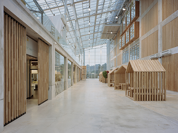
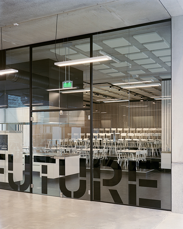
The Co Creation Lab is a joint initiative by the Province of Limburg and Brightlands Greenport Campus Venlo. Situated in the southern part of the Netherlands, the space is a 1.000 m2 hypermodern laboratory for education, research and development of new food concepts in terms of taste, nutrition, health, safety and sustainability in production
The innovation hub brings leading researchers, educators, students, product developers, entrepreneurs and consumers together in order to jointly produce valuable contributions to the solution of of global problems in the field of food safety, food security, and healthy food
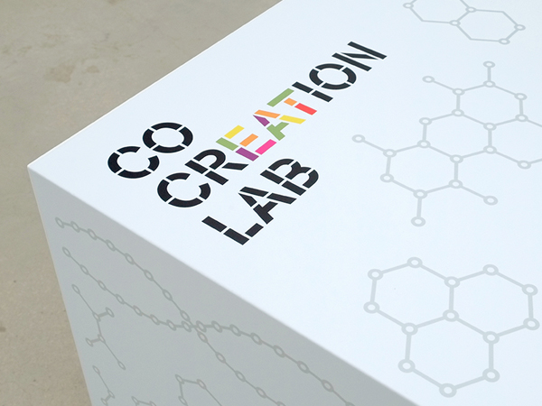
The graphic identity of the Co Creation Lab ( logotype / illustrations / wayfinding / environmental graphics ) is designed by Boy Bastiaens in a close collaboration with Marc and Nicole Maurer, principals of Maurer United Architects, the firm who designed the exterior and interior design of the iconic lab.
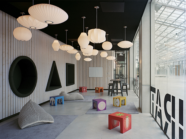
Featuring a series of vegetable & fruit block seats, based upon the square shape of a KletsKruk™ children stool. Covered with a minimalist cross-section and topview illustration of an apple, onion, potato, strawberry, tomato, mushroom, paprika and cucumber which turned each cubic stool into a three-dimensional infographic seat

The vegetable and fruit blocks remained highly recognisable through the use of color. Also these mini-seats for the lab’s youngest users, the Kids University for Cooking, brought some playfullnes into the space and matched nicely with black & white colors and the building’s material palette of concrete, glass, stainless steel and oak.
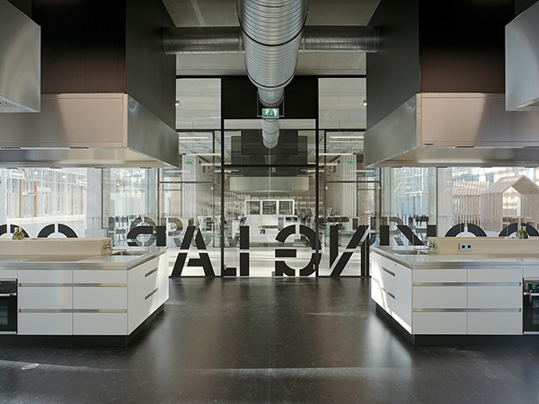
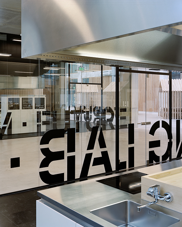
Quite some time was spent on the design of a custom made alphabet. However, the modification of a classic sans serif - by turning this into a stencil letter - proved to be a much better alternative by far. As its timeless visual quality would not detract from the architecture. It worked also better with the existing Brightlands housestyle
While working on the presentation of the new lettering, the hidden word ‘eat’ in the name Co Creation Lab was discovered by coincidence. After adding fruit and vegetable colors to different parts of the black stencil letters the design was presented to the client and adopted immediately as official logotype because of its meaningful layer.