Boy Bastiaens
boy bastiaens  identity
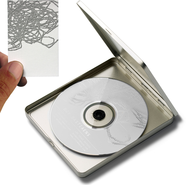
'What looks at first glance as an image of a kid's crayon dragged over a textured surface is actually a complicated image made up of straight lines. In my stationary I use an abstract image of entangled threads, a knot, that needs to be unravelled to get a clear line. A metaphor for the true essence of the initial design process. Where the solving of the problem is embedded in the question itself'.
According to author John Stones “a bold step” in his book No Rules Logos - Radical Design Solutions That Break The Rules (RotoVision, 2009), reviewing the abstract image on the business card of Boy Bastiaens. As “graphic designers are likely to fall prey to predictability when they design for themselves as when they do so for corporate clients, but it doesn't always need to be the case”.
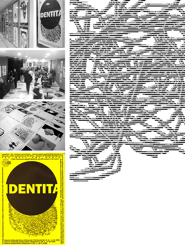
 On the occasion of the 22nd International Biennale of Graphic Design in Brno in the Czech Republic in 2006, designers and illustrators from around the world were invited to participate in a special exhibition called Identita / Identity, fax_mail_ art_design.
Jan Rajlich, Frantisek Borovec and Vaclav Mekyska from the Brno Biennale Association asked them to send their personal vision of the 'identity' conception by fax or email, just in plain a black and white A4 (portrait) format.
After receiving the submissions, the artworks of the 240 international designers were enlarged to an actual poster size. Exhibited at the HaDivadlo, U Dobrého Pastyre, and Kabinet galleries Accompanied with a modest and nice exhibition catalogue.
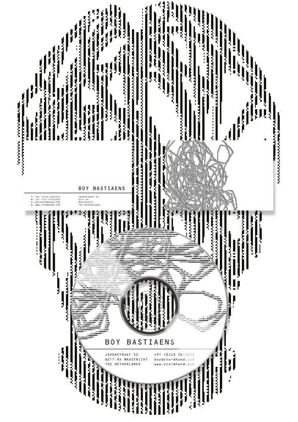
 Most of the information about a person is contained in the face, as the saying goes. An eclectic imaginative rearrangement of the stationary items turned the minimalist design ingredients into a witty selfportrait. Which was selected for the publications MyOwnBusinessCard (Index Books, 2010) and Innovative Stationary Graphics (Monsa Publications, 2011).


